Plain language - what is it really?
It sounds so boring, plain language. ‘Kill the magic, the creativity, the poetry.’ Don’t shine. Don’t sparkle.
If that was true, I wouldn’t work in plain language.
It wouldn’t have captivated me for 15 years.
Plain language is courageously imaginative
You commit to creativity by walking in the shoes of someone very different from you.
If imagination was a sport, plain language is the Ultramarathon. It’s for elite athletes. You commit to imagining:
where someone is when they’re reading
what device they’re reading on
how literate they are
how much they know about your topic
how much they care or don’t care
what will hook them in
what they want to know about your topic.
This blog explains how plain language is defined, and how to use plain language based on that definition. You’ll see why so much imagination is involved!
How is plain language defined?
Communication in which wording, structure and design are so clear that intended readers can easily
find what they need,
understand what they find, and
use that information.
That definition is from the 2023 ISO Plain Language Standard. And that Standard was written by people who speak 17 languages among them.
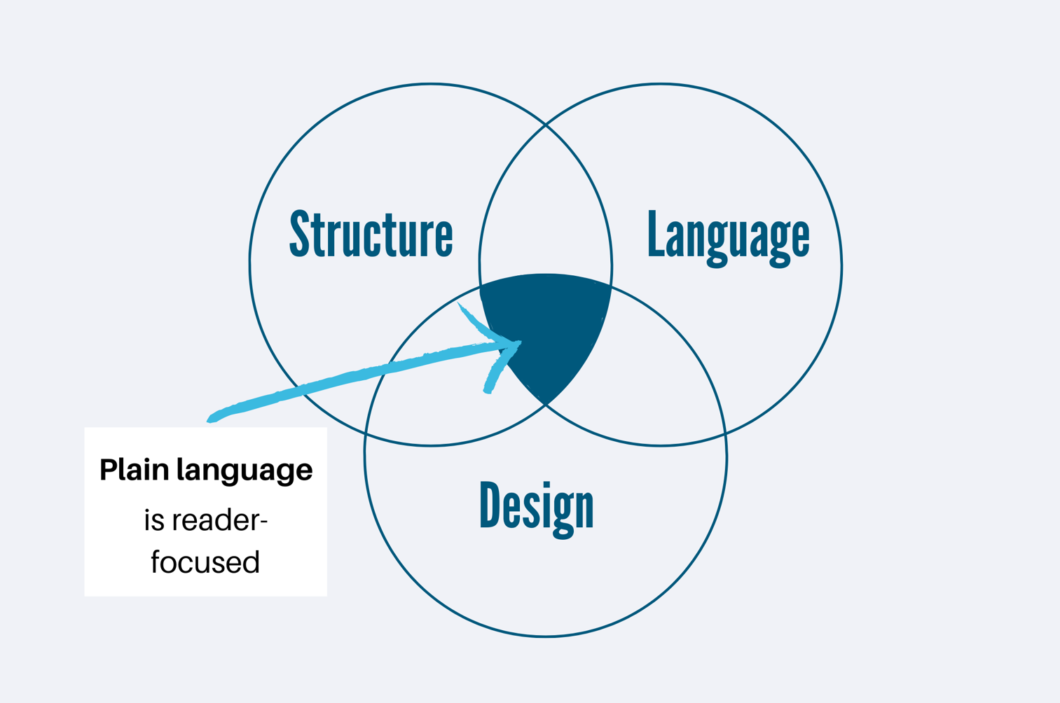
Plain language is the crossover point between 3 ideas
Your reader will find, understand, and use your information best if you put equal care into:
language that works for them
structure that’s intuitive for them
design that helps them see the key ideas.
Plain language is the point where reader-focused structure, language, and design overlap
Why is this crossover point important?
If you only put effort into clear language, your writing will look like a wall of words.
No one wants to read a wall of words
If you only put effort into structure, you’ll have lots of separate units that seem incoherent.
It’s hard to make sense of structure without anything to hold it together.
If you only put effort into design, it’ll look pretty but not have enough meaning to be useful.
A design can be great but it doesn’t say much by itself.
All three need to work together – here’s an example
First we imagine the reader and their situation. In this example, the reader is anyone in New Zealand who is the duty holder at their organisation. (A duty holder is a health and safety position.)
Imagine you’re a duty holder. The government has just asked you to participate in a review because an accident happened at your workplace. What’s the first question that springs to mind?
My guess is your first question is ‘What’s involved in a review?’
Structure: answer the reader’s first question first
In our example, the writer answers ‘what’s involved?’ in the first section, under ‘What happens during a Duty Holder Review.’
Section of an info sheet about a duty holder review.
This comes from an info sheet by WorkSafe Mahi Haumaru Aotearoa
Design: visual variety brings the reader’s eyes to the key points
That main heading is bold and big to grab attention. Next biggest are ‘The planning phase’ and ‘The doing phase’, so at a glance we see the structure that the writer has created for us.
It all makes sense. It seems logical, and so we start reading the sentences under the headings.
Language: simple works best
The best way to write to people at work is to assume:
they’re busy
they’re distracted
they want to understand super quickly.
That’s why this writer used simple words, like ‘planning, doing, and closing’.
It’s not because the writer didn’t know bigger words, like ‘preparation, implementation, and finalisation’.
The writer knew that bigger words would take longer to read.
Bigger words would also overcomplicate what is actually a simple process. Overcomplicated seems hard. Simple seems easy. And the goal of this piece of writing is to encourage people to participate in a review, not put them off.
So the writer chose to use simple words in short sentences.
Let’s look at the three elements in more depth now.
The language element
Which would you rather read from your accountant?
This report and its projections have been prepared on the basis of the information provided by the client.
This report is based on the information you gave us.
Which would you rather read from your local roading authority?
The objective is to proactively react to snow and ice events that affect the road network in order to keep roads open and maintained in a safe condition for motorists as far as reasonably possible during winter, in terms of the defined levels of service.
We aim to keep the roads open and maintained in a safe condition during winter.
Which would you rather read in your insurance policy?
A policy may be cancelled by an insured person (the insured person) by providing the Company with a written notice of said cancellation. The serving of said written notice of cancellation is sufficient and will suffice in making effective the date of cancellation of the policy in the notice of cancellation. That being the end of the policy term, and hence its completion, the said policy will henceforth be cancelled.
To cancel your policy, write to us outlining when you want it cancelled.
It’s a no-brainer, right?
What you like is EXACTLY what other people like too. This bit doesn’t take too much imagination!
Language: write like you speak
Write like you speak.
Write like you speak.
Write like you speak.
If you want more specifics than that…
Choose the simplest word you can for each spot
Write one-idea sentences
Use active voice – here’s a refresher about active voice
Want to know why it doesn’t come naturally to us to write simply? Join the School of unProfessional Writing and find out!
The structure element
Our minds crave order and structure. We can give it to people by putting the bottom line (the key points) up front.
Notice how much more interesting it is to read the bottom line up front.
Why does this not come naturally to us?
At primary school, you learnt Beginning, Middle, End.
At high school, you learnt Introduction, Body, Conclusion.
Both those structures put the key points at the end.
You’ve never learnt any other structure (unless you studied journalism!)
Structure: bottom line up front
So, ta da! Here’s a structure that works for busy readers. It’s called Bottom Line Up Front (BLUF). Tattoo it on your knuckles. You can’t go wrong if you put the bottom line up front.
Why? Because readers pay attention at the start and quickly lose interest. In the diagram below, red is where eyes spend the most time, and blue is the least time.
Where our eyes go when we’re skim reading – called the F pattern.
F-Shaped Pattern For Reading Web Content by the Nielson Norman Group
The design element
Look closely at the picture above and you’ll see the eye ‘starts again’ wherever something pops visually.
Images
Text boxes
Headings
New paragraphs
Bullets
So do this in your own writing. Visually emphasise the things you want readers to spend time on. Notice how much more quickly you take in the BLUFs when they’re emphasised:
Your eye skims the headings and you instantly learn the BLUFs.
Here’s another example that shows how even basic formatting makes an email waaaay quicker and easier to read.
Notice how even basic headings and bullets make information pop.
Design: visual variety and white space
This is another simple but profound gift you can give your readers:
Hit Enter more often – give them more white space
Add headings and bullets
Vary your paragraph length
PS: It’s fine to have the odd one-sentence paragraph!
Why does this not come naturally to us?
We had paragraphing style drummed into us at school and university
Do you remember being told a paragraph had to have 3 or 4 sentences?
No teacher or lecturer expected us to add headings or bullets, so we got used to writing paragraphs
They look formal and proper – they’re what got you the high marks
We want to do our best at work, so we continue to do what we learned at school and university.
The problem is, we’re not writing for teachers or lecturers now. We’re writing for busy, distracted people who skim-read. By far the best way to get them to read more of your writing is to add more visual variety and white space.
Summary
We started with this idea, based on the ISO Plain Language Standard:
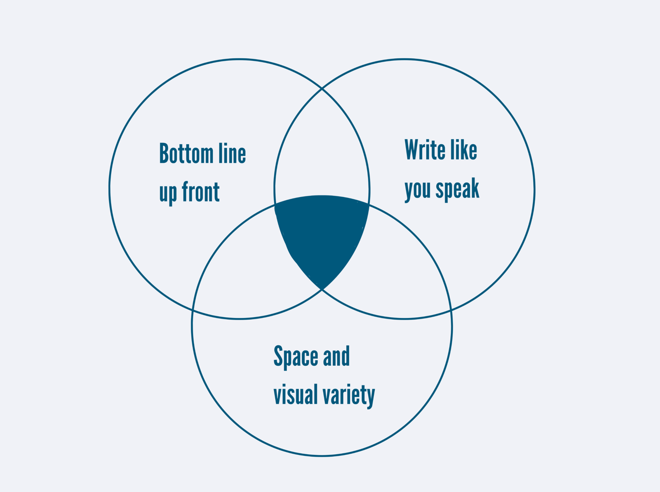
Then we imagine our reader’s experience as they read. We create reader-focused language, structure, and design by keeping 3 core ideas in mind:
A shortcut to writing in plain language – remember these 3 tips.
Want to get into any of this in more detail?
Join the School of unProfessional Writing
Our goal is to help people get unschooled – to shed all the unhelpful rules we picked up at school and university. We want your writing to work brilliantly for readers in a work context.
I hope to see you there!
Colleen


